Client — Organize
Project — Organize, a passionate group looking to shine a light on inefficiencies and failures within the organ donation system, were looking for ways to convey their research findings visually.
Role — UX and Visual Design, assembling the site
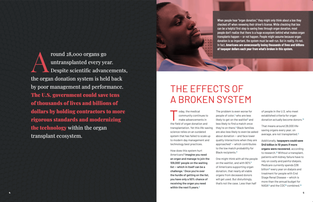
Why it’s important — The organ donation system in the U.S. is fundamentally broken. It’s self-governed, meaning there are no consequences for poor or dangerous performance. A majority of organ procurement organizations (OPOs) are considered underperforming or failing, and have lost thousands of viable organs through mismanagement. Because of the failure of OPOs, 31 Americans died every day in 2021 because they didn’t get a needed organ transplant.
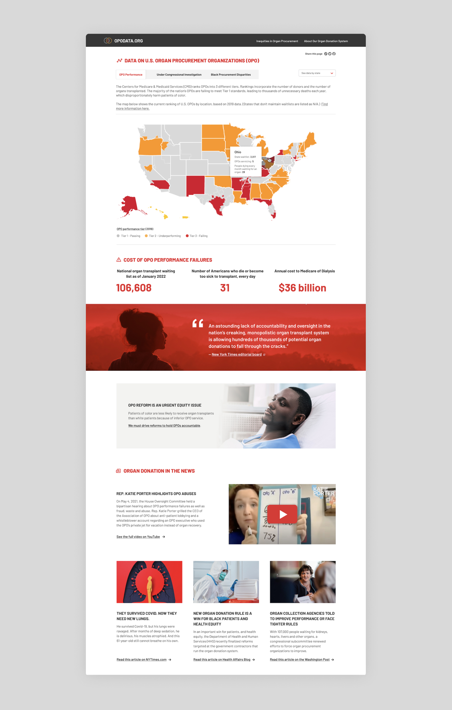
OPODATA.ORG Homepage
Summary of Findings Spread
After building a web version of the full report, I created a printable document summarizing the findings. You can find the full PDF here.
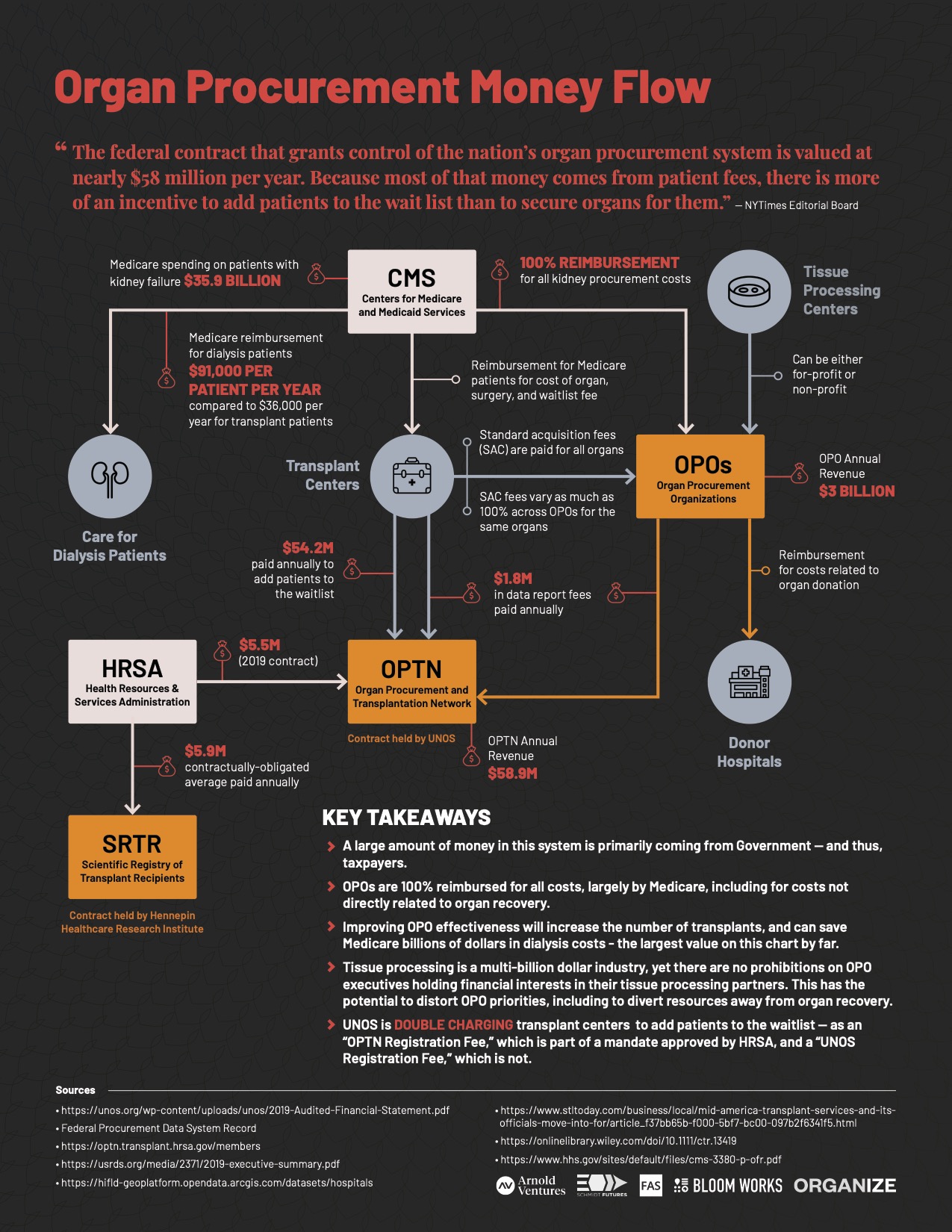
Organ Procurement Money Flow
One of several maps detailing current or proposed relationships within the organ procurement ecosystem. This one in particular outlines the way money flows across different players involved in an organ transplant. The challenge with this design was to fit everything within a single 8.5×11 sheet — a requirement so it would be easy to share in person.